A while back, I posted something on LinkedIn (URL to post: here) where I shared that the hierarchy control was going to be deprecated soon. The cool thing is that now there is a new Visual Hierarchy experience that looks really nice and has improvements in comparison to the previous control.
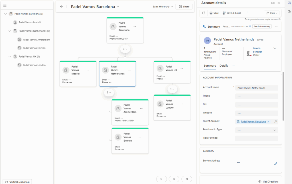
- More ways of displaying the hierarchy (horizontal/vertical)
- More options to configure/control the information being displayed
- Data details are available on the right side
How does the new visual hierarchy experience work?
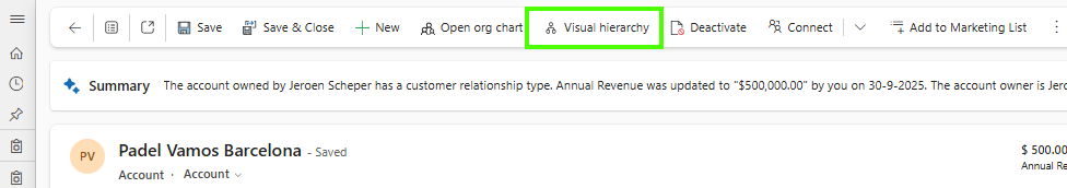
Once you have configured and published the new visual experience, which we will touch on in a bit, there will be a new button available in the ribbon called Visual hierarchy.
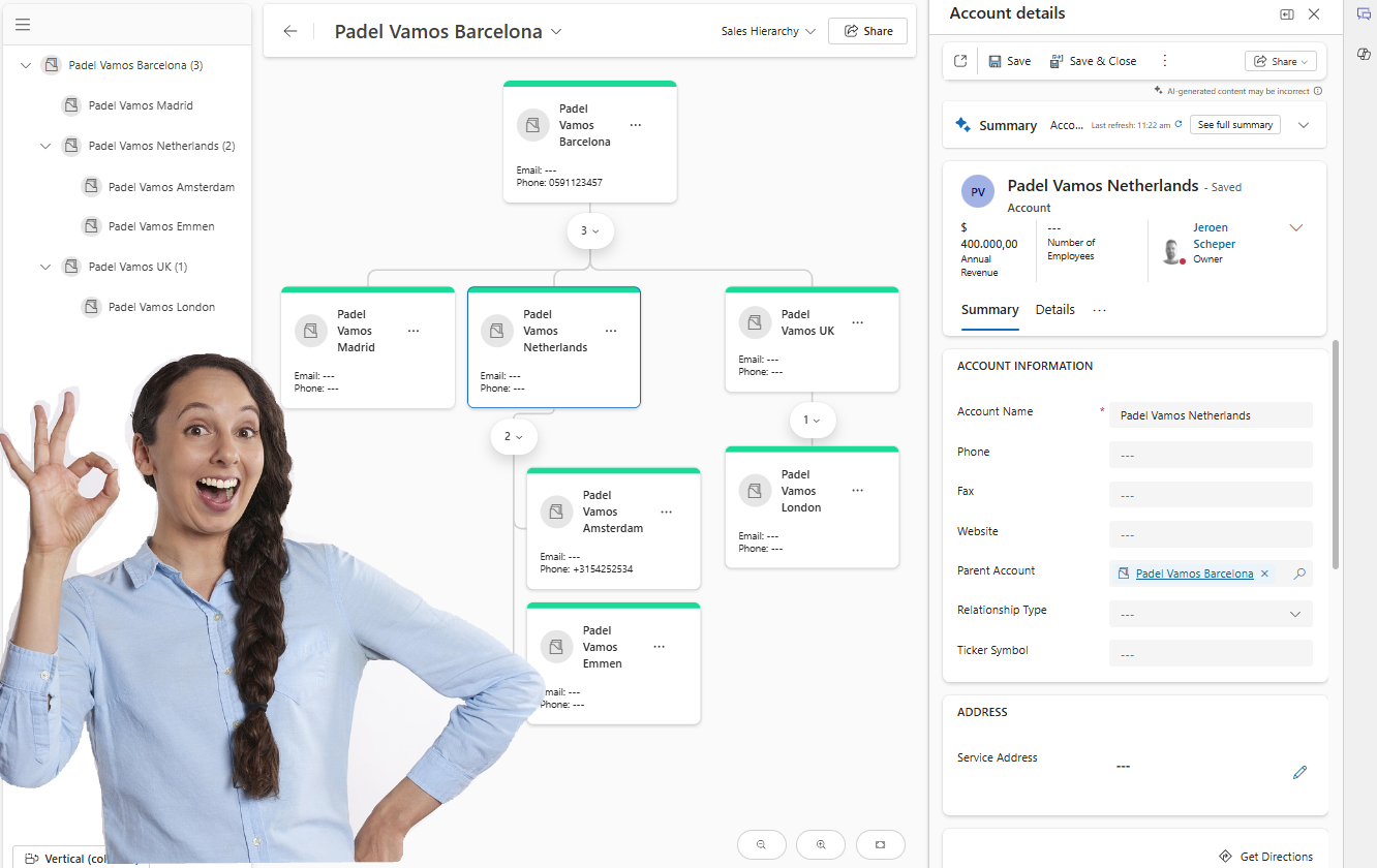
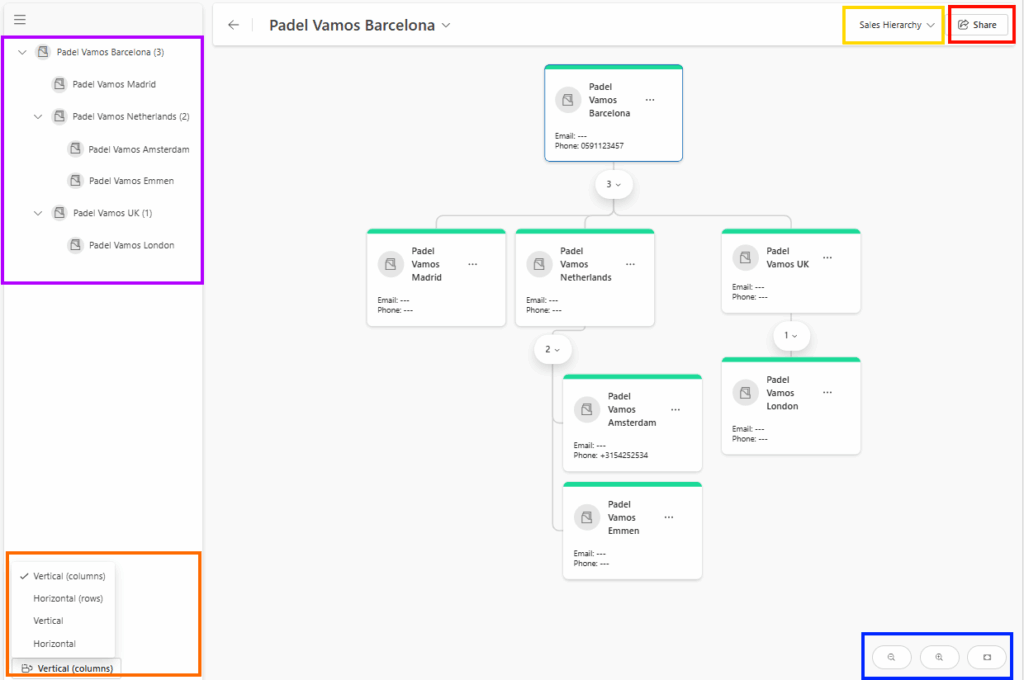
When the launched, the experience could be as follows:
- Purple section: This is where you can see the hierarchy in a “tree view” that also shows the number of direct child records.
- Orange section: This is where you can control how you want the hierarchy to be displayed. The standard experience is more vertically oriented, but you do have options now to display the hierarchy in a more horizontal experience.
- Blue section: This is where you can zoom in and out in the hierarchy
- Yellow section: This is where you can switch hierarchies. If you have published more hierarchy configurations for a table, then this is where you can navigate between the hierarchies.
- Red section: This is where you can get the URL of your hierarchy and share it with colleagues who have access to Dynamics 365CE.
How to configure the new visual hierarchy experience
In order to configure the new visual hierarchy experience, you can follow the next steps:
- Open the Sales Hub app
- Change the area in the bottom left settings and navigate to App Settings
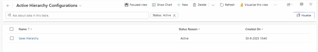
- Within the General Settings section, select Visual Hierarchy
- Choose Monitor activity
- Select +New from the ribbon
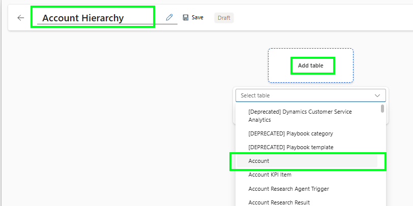
- First, give the hierarchy a proper and meaningful name
- Select Add table and find the table where you want to create a new Visual Hierarchy.
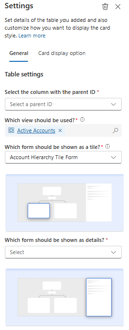
- Now you have a couple of settings to make on the General tab:
- Select Column with the parent ID, so that column identifies the parent of the record
- Which view should be used?, fsdfsdf
- Which form should be shown as a tile? The interesting bit here is that it does show all the different types of forms, and after selecting, you can see the preview on the tile straight away
- Which form should be shown as details? The form that will be used when clicking on a tile in the visual hierarchy
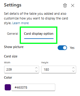
- On the Card display option tab, you have the ability to:
- Enable pictures, if applicable, of course, for your table
- Define the card size
- Set a tile header color
- The last step would be to Save your hierarchy, and don’t forget to Publish it 😎
The new visual hierarchy experience, overall, I believe, is giving quite some flexibility to admins to build nice graphs. A great addition if you ask me, instead of focusing on the parent/child relation of the same table, would be to allow cross-table visualizations. So, for example, on top of your hierarchy, you select the account, then the level below the Open Opportunities, and the level below that, also the Open Quotes linked to the Open Opportunities again.