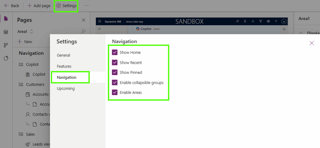
When building a model-driven app, the menus can grow rapidly because lots of menu items are being added. Smarter navigation in model-driven apps can help tailor this by making it more “personal”. For most of these, you can decide in which Area or Section you want to add these, but did you know you can show/hide and enable/disable the following standard components as well:
- Home
- Recent
- Pinned
- Collapsible Groups
- Area

Below, you can find a quick summary of what each of the components is and what I think some of the pros and cons are. Smarter navigation in model-driven apps can help make your model-driven app more personal, where, for others, probably more experienced users, this is just overhead that is cluttering up the menu.
Home or not to Home
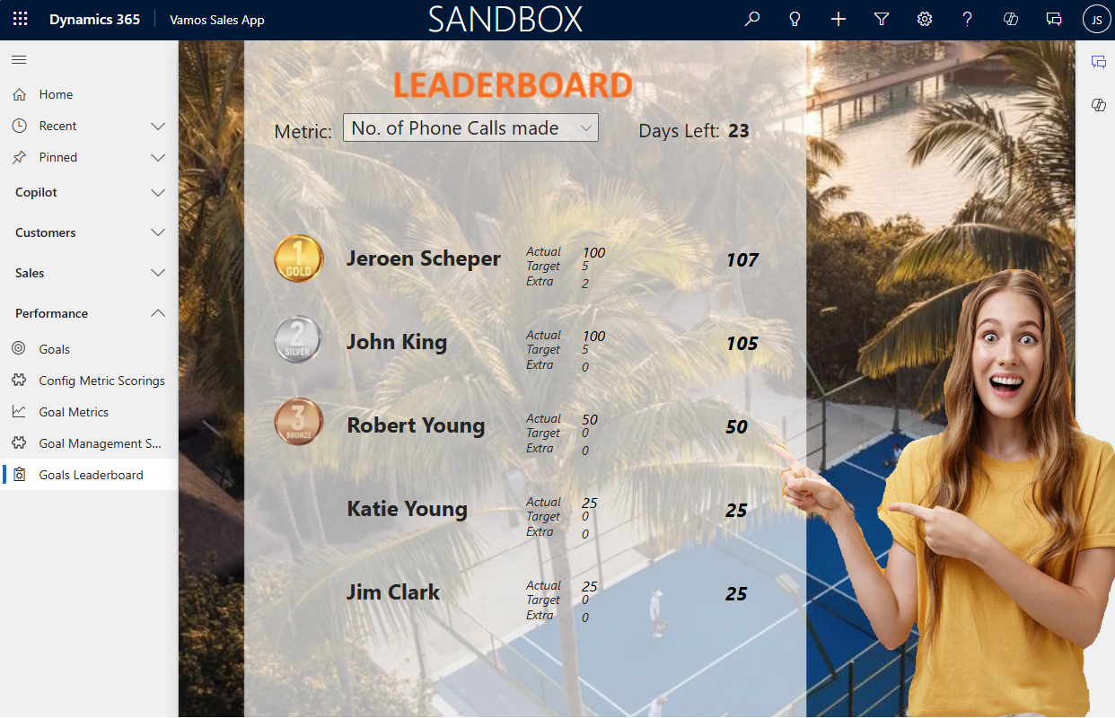
The first setting in order to set up smarter navigation in model-driven apps is the green-highlighted section in the top image of this post, which is the Home menu item. For most people, this is a button that gives them “comfort” and allows them to navigate back quickly.
| Show Home | Hide Home |
| Faster navigation back to the Start Users can quickly return to the app’s main dashboard or landing page, really helpful when they get lost. | Cleaner & Minimalistic navigation Reduces overhead, users don’t use the button, and therefore, it is just “consuming” space. |
| Better for new or inexperienced users The Home button acts as a safety anchor that makes navigation easier for people who are not familiar with the app structure. Similar user experience to website navigation or other Microsoft products. | |
Recent Items
The Recent menu items, orange in the top image, keep track of the last 10 records, views or dashboards that you visited. This can be handy to navigate quickly back to something or even as a starting point to put items in your Pinned list.
| Show Recent Items | Hide Recent Items |
| Faster navigation for users Users can quickly jump back to records they recently viewed (e.g., Accounts, Cases, Opportunities), reducing clicks and improving productivity | Can clutter the navigation If the app needs a very streamlined or guided user experience, Recent may distract users or lead them into tables/entities that aren’t meant to be the focus. |
| Supports high-volume, transactional work For roles that open many records in a short time, for example, case workers, sales reps, or service staff, the Recent list acts as a shortcut to common work | |
Pinning
The purple section in the top image is the section where your pinned items will be listed. You can pin items from the Recent items list. Once they are in that list, and you want to unpin them if you want, you can do this from the list with pinned items.
| Show Pinning | Hide Pinning |
| Gives users quick access to their most-used records and views Pinning is a powerful personalization feature. It allows each user to create shortcuts to the data they work with most, improving efficiency and reducing navigation time. | Potential inconsistency across users Pinned items vary per user, which can cause confusion during training or support (“I don’t see what you see”). This can complicate documentation and helpdesk guidance |
| Can clutter the UI if overused Some users pin too many items, leading to a messy navigation bar and reduced clarity in their workspace | |
Collapsible groups
The red section of the first image of this post is an example where the Collapsible groups are enabled. For some, perhaps a great feature because it gives an organised experience, where other users perhaps struggle to find the menu items they are looking for.
| Enable Collapsible groups | Disable Collapsible groups |
| Cleaner, more compact navigation Users can collapse areas they don’t use often, reducing scrolling and helping them focus on the parts of the app that matter most | More interaction steps Users must expand a group before selecting a table, which adds extra clicks for frequently used sections |
| Supports apps with many tables/entities When the sitemap is long, collapsible groups prevent overwhelming the user and make the navigation feel structured and organized | Does not work when in minimalize mode The collapsible groups do not work when the sitemap is minimised. This can cause extra confusion when users often use this feature. |
Enable Areas
In the yellow section, you have the option to change areas, if applicable. These can be very handy to streamline menu items that are used in different processes, while for other users it can just be just too many clicks to find their items.
| Enable Areas | Disable Areas |
| Increases navigation steps Users may need to click into the correct Area before accessing specific tables or dashboards, slowing down frequent tasks. | Faster navigation for task-focused roles With only one Area, users go straight to the content without switching sections, reducing clicks and mistakes. |
| Clear separation of major functional domains When users work across different processes (e.g., Accounts vs. Case Management), Areas provide a high-level structure that keeps navigation organised and logical | |
How to set up smarter navigation in model-driven apps
In order to set up smarter navigation in model-driven apps, you can manage this via model-driven app settings, which are configurable for each individual model-driven app. The Settings allow you to show/ hide or enable/disable these items. You can follow the next steps:
- Open the model-driven app by selecting Edit
- Select Settings from the menu bar
- Navigate to Navigation
- Configure the menu items as you need