
Sometimes you stumble upon a feature that makes you think “that is pretty cool 😎”. There are plenty of ways of interrogating sales data within Dynamics 365 which I will touch in a bit, but there is also an option that I was not aware of is to visualize your view with Power BI without needing super much Power BI skills.
A few of the options that you have available in the platform to analyze sales data:
- Dashboards; interactive dashboards that can contain charts, lists, HTML pages, external websites and resources.
- Advanced Find; feature that allows you to search and filter on records and save these queries as views
- Charts; visual representation of information
- Views; a list with records that contains one or multiple columns that also allow you to filter and sort on. Blog post I recently created about the new enhanced grid option is worthwhile checking.
Enhanced grid options to analyze data – JScheper.com - Reports; Reports allow you to create some simple static overviews
- Excel; Export data to Excel and leverage all features and functionalities that Excel is offering
- Copilot; The “new kid on the block” that allows you to use AI prompting to analyze data. Microsoft has shared some of the prebuild prompts as well as some ideas about prompts you can tailor yourself.
Prebuild prompts: Prompt guide reference | Microsoft Learn
Custom prompts: FAQ about natural language chat in Copilot | Microsoft Learn
Enable the feature
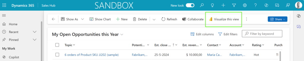
Now we have highlighted some of the features and tools that are available, it is time to talk about the Visualize your view in Power BI feature. Once set-up for your model-driven app, the following button will appear on your tables.
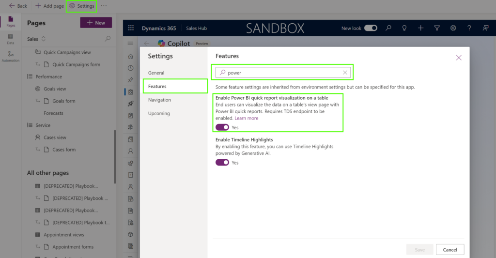
It could be very well that this setting is already enabled for your model-driven app, yes you read this correctly, it is a setting that is on app basis and not environment. The setting is a bit hidden and probably not where you expect it to be, but you can find it by following the next steps:
(Thank you Megan for the post that explains these “hidden settings” which this one is part of)
- Open make.powerapps.com
- Select the right Environment from the top ribbon
- Navigate to Apps from the menu on the left
- Select your model-driven app, in my scenario: Sales Hub and select Edit
- Select Settings from the top menu and choose Features from the sub-menu
- Search for the word Power
- Enable the setting Enable Power BI quick report visualization on a table
Visualize your view with Power BI
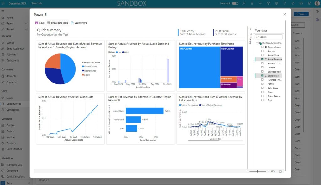
Now the feature is enabled, you should open any table and start having fun with this. In my example I have created a custom view with some fields that I would like to use in my Power BI report. When pressing the Visualize this view button, Power BI generated the report. It will try to identify patterns and will select a couple of fields to create the initial dashboard. This can all be updated at a later stage. Your initial report is ready, et voila 😎
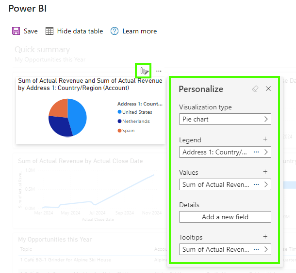
Personalize your Power BI report
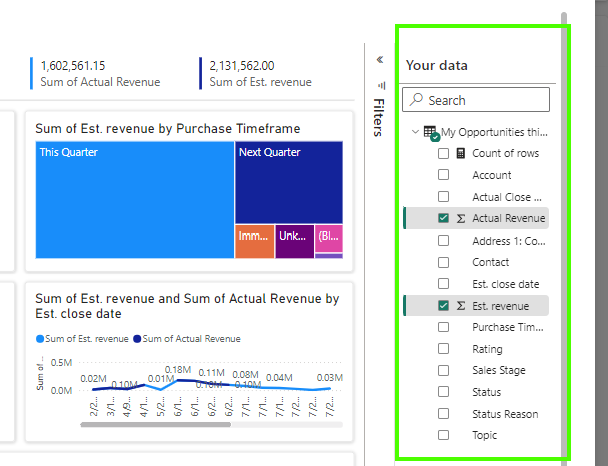
Now you can tailor the whole dashboard by making changes in the Your Data pane is probably the simplest thing to do. By selecting the fields that are important to you, the report will be refreshed automatically. Depending on the type of field you can also determine how fields should be aggregated (for example count, average or sum).
If you want to tailor the experience completely to your needs, you can select the Personalize button on each of the charts. Depending on the type of chart you cab then define which fields need to be shown in your visual. Microsoft has some great documentation about the different types of visuals that are available to you, and provide good use cases for each of the different visuals.
Visualization types in Power BI – Power BI | Microsoft Learn
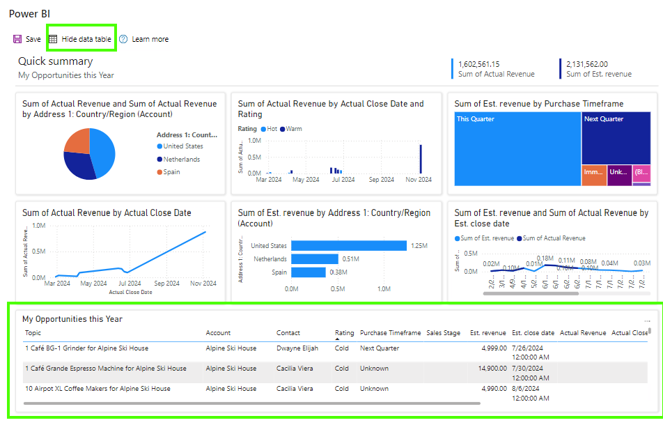
Show data table
At the top you have the Show data table / Hide data table button available which will show or hide a sub grid at the bottom of your report with the plain data.
Save your report
You need to explicitly Save your dashboard in order to use it again in the future. In order to save it your just need to provide a Name and a Workspace where you want to save this in. The workspaces available to you are depending on the roles that you have for each of the workspaces.
After this is saved, your dashboard is now saved as a Power BI dashboard and should be maintained from that tool making forwards.
Some final notes on this feature.
- Power BI is connecting to Dynamics on behalf of the user that clicked the Visualize view Power BI button, so this means that security roles assigned in Dataverse will apply.
- Unfortunately you can’t re-open your created dashboard on the Dynamics 365 side which is if you ask me quite disappointing.

Nice! I know this feature has been around for a while but good to see some ideas and suggestions for using it. Also good to understand how the security works. Curious how you get back to the report you just saved? Can you do that from the button on the view, or at that point is it now only in the PBI workspace you saved it to?
Thank you for your feedback Megan and I will update the article slightly
– Power BI is connecting to Dynamics 365 and it will apply the security roles available to you. The one thing I do found odd is the Export to Excel. This feature you can control via security roles in Dynamics 365 but apparently on the Power BI side you this is controlled separately.
– Good point about what’s next after saving, it becomes a Power BI report and you can update / manage from there. Which, if you think about this, a bit said that you can’t pull it back on the screen easily in Dynamics 365.